INTEGRATED RISK MANAGEMENT WITH PEAT
- By Admin
- March 11, 2015
- Comments Off on INTEGRATED RISK MANAGEMENT WITH PEAT
This whitepaper showcases a capstone analysis of a portfolio of projects that applies all of the Integrated Risk Management® (IRM) steps introduced by Real Options Valuation, Inc. Before diving into the details of the portfolio project analysis, let’s first review the IRM process and recap how these different techniques are related in a risk analysis and risk management context in a seamless analytical framework. The IRM framework comprises eight distinct phases of a successful and comprehensive risk analysis implementation, going from a qualitative management screening process to creating clear and concise reports for management. The process was developed by the author based on previous successful implementations of risk analysis, forecasting, real options, valuation, and optimization projects both in the consulting arena and in industry‐specific problems. These phases can be performed either in isolation or together in any combinatorial sequence for a more robust integrated analysis. Although the steps presented below represent the most usual implementation path, modifications can be applied as required based on the uniqueness in the projects under analysis. Figure 1 reviews the integrated risk management process up close. The IRM process can be divided into the following eight simple steps:
- Qualitative Management Screening. Management has to decide which projects,assets, investments, initiatives, or strategies are viable for further analysis, in accordance with the firm’s mission, vision, goal, or overall business strategy. These business requirements may include market penetration strategies, competitive advantage, technical, mergers and acquisition, growth, synergistic, or globalization issues.
- Forecast Prediction. Risk always pertain to the unknown future; hence, to perform IRM, future values are forecasted using time‐series analysis, econometric modeling, fuzzy logic, neural networks, nonlinear extrapolation, stochastic processes, ARIMA, GARCH, multivariate regression forecasts, and others.
- Base Case (Net Present Value Modeling). For each project that passes the initial qualitative screens a static base case model is created. Typically, a discounted cash flow model is used and serves as the base case analysis where a net present value is calculated for each project, using the forecasted values in the previous step. This net present value is calculated by the traditional approach of using the forecast revenues and costs, and discounting the net of these revenues and costs at an appropriate risk‐adjusted rate.
- Monte Carlo Risk Simulation and Risk Analytics. Usually, a tornado sensitivity analysis is first performed on the discounted cash flow model; that is, setting the net present value as the resulting variable, we can change each of its precedent variables and note the change in the results. The uncertain key variables that drive the net present value and, hence, the decision are called critical success drivers. These critical success drivers are prime candidates for Monte Carlo risk simulation where thousands of trials of each input assumption are generated to account for all possible outcomes and scenarios that are modeled.
- Real Options Problem Framing. The risk information obtained somehow needs to be converted into actionable intelligence. The first step in real options is to generate a strategic map through the process of framing the problem.
- Real Options Modeling and Analysis. The present value of future cash flows for the base case discounted cash flow model is used as the initial underlying asset value in real options modeling, and risk simulation generates the required volatility inputs. Using these inputs, real options analysis is performed to obtain the projects’ strategic option values.
- Portfolio and Resource Optimization. If the analysis is performed on multiple projects, management should view the results as a portfolio of rolled‐up projects because the projects are, in most cases, correlated with one another, and viewing them individually will not present the true picture. As firms do not only have single projects, portfolio optimization based on budgetary, resource, and schedule constraints is crucial.
- Reporting, Presentation, and Update Analysis. The analysis is not complete until reports can be generated. The process should also be shown along with presentation of the results. Clear, concise, and precise explanations transform a difficult black‐box set of analytics into transparent steps.
Project Economics Analysis Tool (PEAT)
The remaining sections illustrate how the IRM process can be run seamlessly to provide a comprehensive risk‐based decision analytics framework through the use of the Project Economics Analysis Tool (PEAT) software. PEAT has over 20 related registered patents and patent‐pending technologies and incorporates all the elements of IRM in a simple‐to‐use software. See the About the DVD for more details on obtaining a trial version of the software and see the actual DVD for additional getting started videos and PEAT documentation. Figure 2 illustrates the PEAT software utility. This software was designed to apply IRM methodologies (Monte Carlo risk simulation, strategic real options, stochastic and predictive forecasting, business analytics, business statistics, business intelligence, decision analysis, and portfolio optimization) to project and portfolio economics and financial analysis. The PEAT utility can house multiple industry‐specific or application‐specific modules such as oil and gas industry models (industry specific) or discounted cash flow model (application specific). The utility can house multiple additional types of models (industry or application specific) as required. The user can choose the module desired and create a new model from scratch, open a previously saved model, load a predefined example, or exit the utility. As shown in Figure 2, multiple modules exist in PEAT, and you can see Chapter 16 for PEAT’s Enterprise Risk Management module and Technical Note 6 in Dr. Johnathan Mun’s Modeling Risk, Third Edition, for an example of how the Dynamic Project Management module works. There are some proprietary modules that were customized for companies and will not be discussed (e.g., Saudi Aramco, Northrop Grumman, Cubic, Arco, 3M, and others). For illustrative purposes, we focus on the Discounted Cash Flow (DCF) module. For the reader to follow along the analysis, select the DCF module and click the Load Example to obtain a pre‐generated model and example
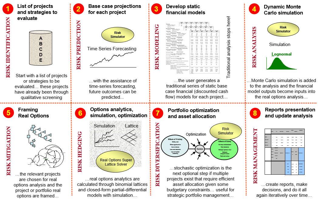
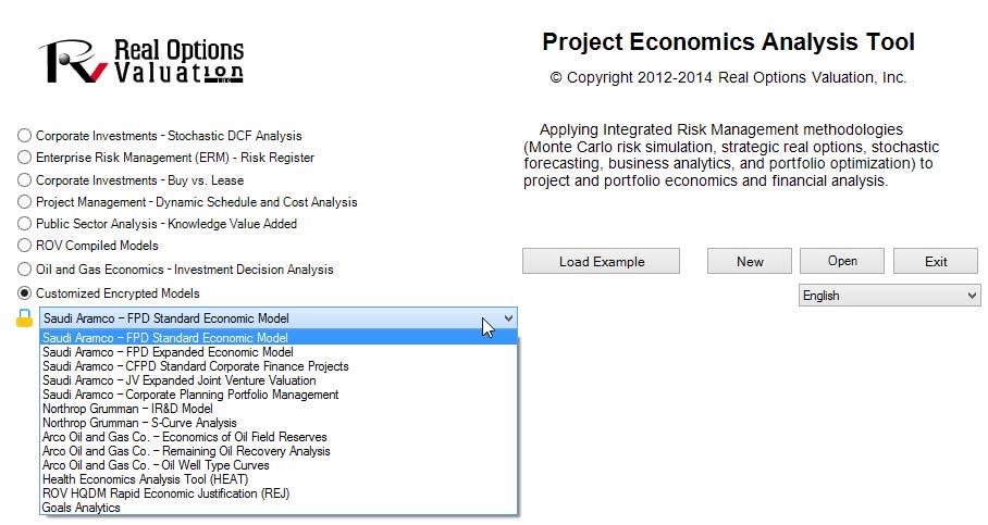
Figure 3 illustrates the main PEAT software where its menu items are fairly straightforward (e.g., File | New or File | Save items that are self‐explanatory). The software is also arranged in a tabular format. There are three tab levels in the software, and a user would proceed from top to bottom and left to right when running analyses in the utility. For instance, a user would start with the Discounted Cash Flow (Level 1) tab, select Custom Calculations or Option 1 in (Level 2), and begin entering inputs in the 1. Discounted Cash Flow (Level 3) tab. The user would then proceed to the 2. Cash Flow Ratios (Level 3), and then on to the 3. Economic Results (Level 3) subtab, and so forth. When the lowest level subtabs are completed, the user would proceed up one level and continue with Option 2 (Level 2), Option 3 (Level 2), Portfolio Analysis (Level 2), and so forth. When these tabs at Level 2 are completed, the user would continue up a level to the Applied Analytics (Level 1) tab, and proceed in the same fashion. All Level 1 tabs are identical regardless of the module (Discounted Cash Flow Model or Oil and Gas Model, etc.)chosen as illustrated in Figure 2, except for the first tab (Discounted Cash Flow).
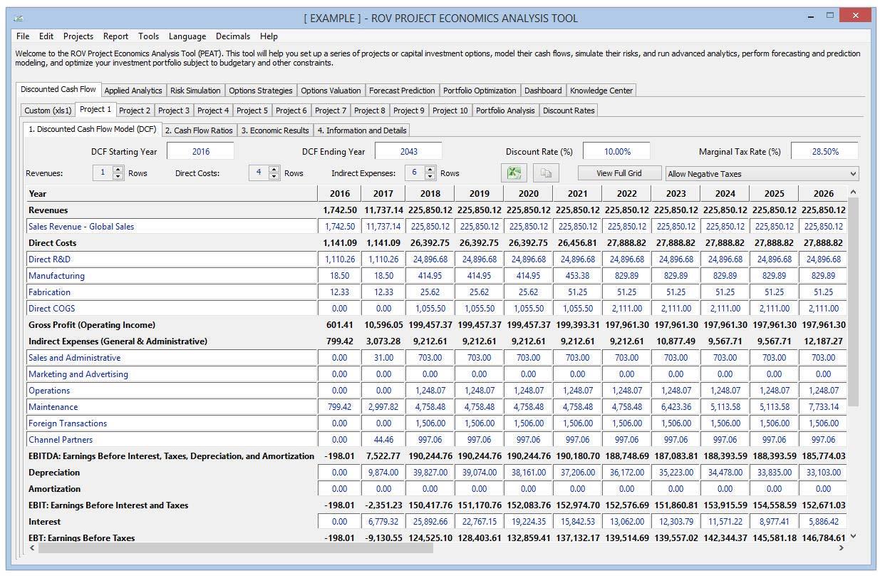
Discounted Cash Flow Model
The Discounted Cash Flow section shown in Figure3 is at the heart of the analysis’ input assumptions. Users would enter their input assumptions—such as starting and ending years of the analysis, the discount rate to use, and the marginal tax rate—and set up the project economics model (adding or deleting rows in each subcategory of the financial model). Additional time‐series inputs are entered in the data grid as required, while some elements of this grid are intermediate computed values. The entire grid can be copied and pasted into another software application such as Microsoft Excel, Microsoft Word, or other third‐party software applications, or can be viewed in its entirety as a full screen pop‐up. Users can also identify and create the various options, and compute the economic and financial results such as net present value (NPV), internal rate of return (IRR), modified internal rate of return (MIRR), profitability index (PI), return on investment (ROI), payback period (PP), and discounted payback (DPP). This section will also auto‐generate various charts, cash flow ratios and models, intermediate calculations, and comparisons of the options within a portfolio view, as illustrated in the next few figures. As a side note, the term options is used in PEAT’s DCF module to represent a generic analysis option, where each option can be a different asset, project, acquisition, investment, research and development, or simply variations of the same investment (e.g., different financing methods when acquiring the same firm, different market conditions and outcomes, or different scenarios or implementation paths). Therefore, instead of naming these tabs projects, which may denote a more restrictive view, the more flexible terminology of option is adopted instead.
Procedure
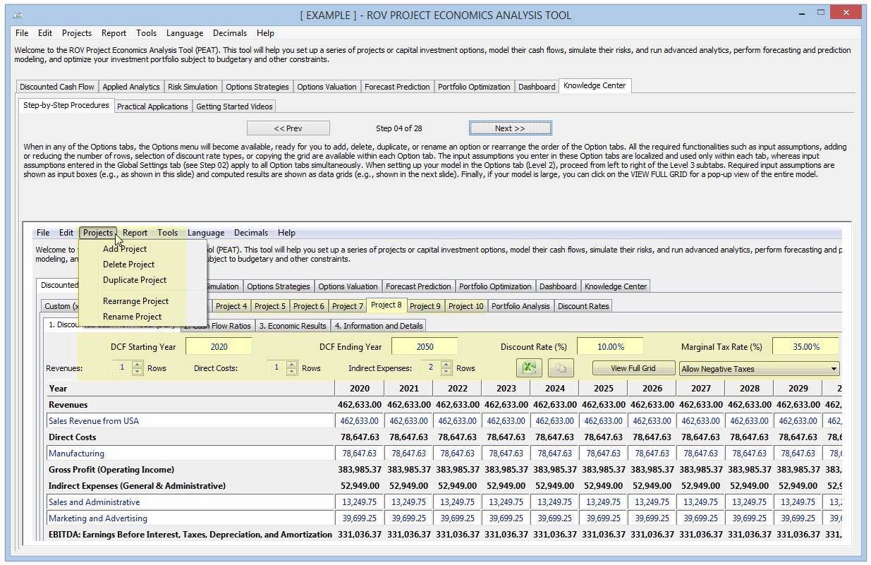
When the user is in any of the Options tabs, the Options menu will become available, ready for users to add, delete, duplicate, or rename an option or rearrange the order of the Option tabs by first clicking on any Option tab and then selecting Add, Delete, Duplicate, Rearrange, or Rename from the menu. All of the required functionalities such as input assumptions, adding or reducing the number of rows , selecting discount rate type, or copying the grid are available within each Option tab. The input assumptions entered in these individual Option tabs are localized and used only within each tab, whereas input assumptions entered in the Global Settings (to be discussed later) tab apply to all Option tabs simultaneously. Typically, the user will need to enter all the required inputs, and if certain cells are irrelevant, users will have to enter zeros. Users can also increase or decrease the number of rows for each category as required. The DCF Starting Year input is the discounting base year, where all cash flows will be present valued to this year. The main categories are in boldface, and the input boxes under the categories are for entering in the line item name/label. Users can click on Copy Grid to copy the results into the Microsoft Windows clipboard in order to paste into another software application such as Microsoft Excel or Microsoft Word. Finally, the Full Screen button pops up the data grid to a full screen to facilitate the viewing of the model in its entirety without the need to scroll to the left/right or up/down. The grid will be maximized to full view, which facilitates the taking of screen shots. Figure 4 illustrates the Cash Flow Ratios that are automatically calculated. This tab is where additional balance sheet data can be entered (current asset, shares outstanding, common equity, total debt, etc.) and the relevant financial ratios will be computed (EBIT, Net Income, Net Cash Flow, Operating Cash Flow, Economic Value Added, Return on Invested Capital, Net Profit Margin, etc.). Computed results or intermediate calculations are shown as data grids. Data grid rows are color coded by alternate rows for easy viewing. Users can enter the input assumptions as best they can, or they can guess at some of these figures to get started. The inputs entered in this Cash Flow Ratios subtab will be used only in this subtab’s balance sheet ratios. The results grid shows the time series of cash flow analysis for the option for multiple years. These are the cash flows used to compute the NPV, IRR, MIRR, and so forth.
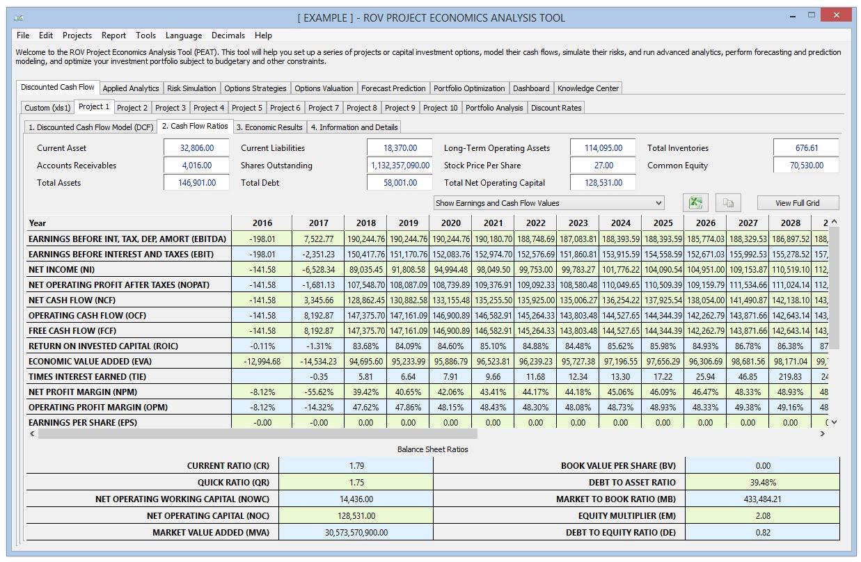
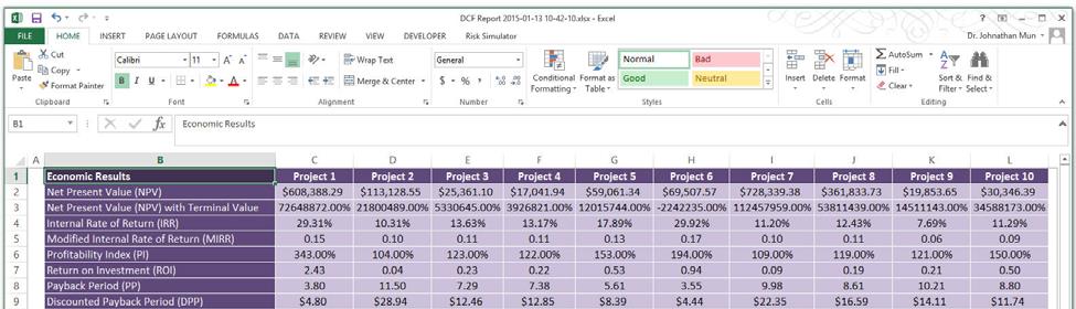
Figure 5 illustrates the Economic Results of each option. This Level 3 subtab shows the results from the chosen option and returns the NPV, IRR, MIRR, PI, ROI, PP, and DPP. These computed results are based on the user’s selection of the discounting convention, if there is a constant terminal growth rate, and the cash flow to use (e.g., net cash flow versus net income or operating cash flow). An NPV Profile table and chart are also provided, where different discount rates and their respective NPV results are shown and charted. Users can change the range of the discount rates to show/compute by entering the From/To percent and clicking on Update, copy the results, and copy the profile chart, as well as use any of the chart icons to manipulate the chart’s look and feel (e.g., change the chart’s line/background color, chart type, chart view, or add/remove gridlines, show/hide labels, and show/hide legend). Users can also change the variable to display in the chart. For instance, users can change the chart from displaying the NPV profile to the time‐series charts of net cash flows, taxable income, operating cash flows, cumulative final cash flows, present value of the final cash flows, and so forth. Users can then click on the Copy Results or Copy Chart buttons to take a screen shot of the modified chart that can then be pasted into another software application such as Microsoft Excel or Microsoft PowerPoint. The Economic Results subtabs are for each individual option, whereas the Portfolio Analysis tab (which is shown later as Figure7) compares the economic results of all options at once. The Terminal Value Annualized Growth Rate is applied to the last year’s cash flow to account for a perpetual constant growth rate cash flow model, and these future cash flows, depending on which cash flow type chosen, are discounted back to the base year and added to the NPV to arrive at the perpetual valuation.
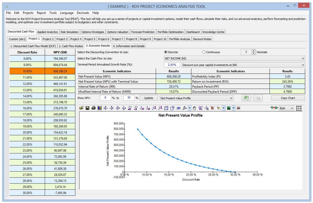
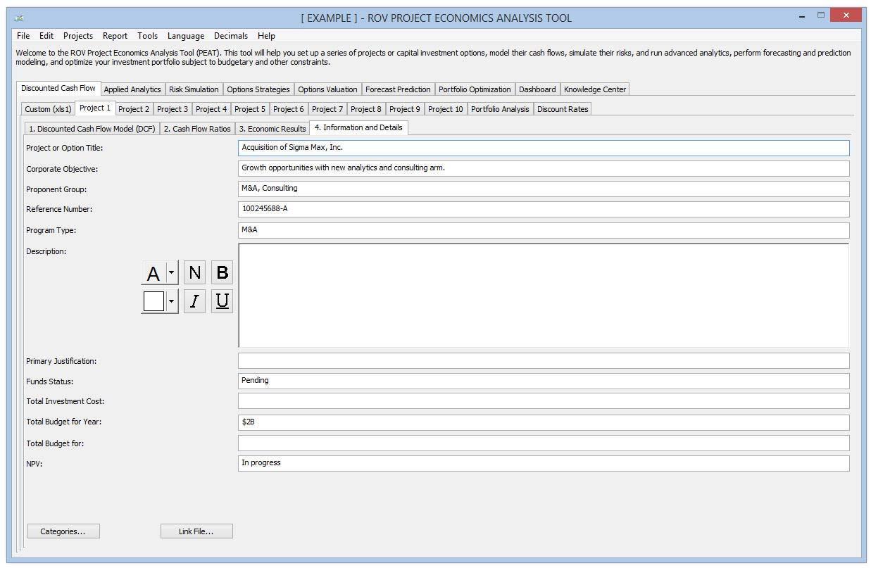
Figure 6 illustrates the Information and Details tab. Users would select this tab for entering justifications for the input assumptions used as well as any notes on each of the options. For numerical calculations and notes, use the Custom calculation tab (discussed later; see Figure 8) instead.Users can also change the labels and Categories of the Information and Details tab by clicking on Categories and editing the default labels. The formatting of entered text can be performed in the Description box by clicking on the various text formatting icons.
Static Portfolio Analysis and Comparisons of Multiple Projects
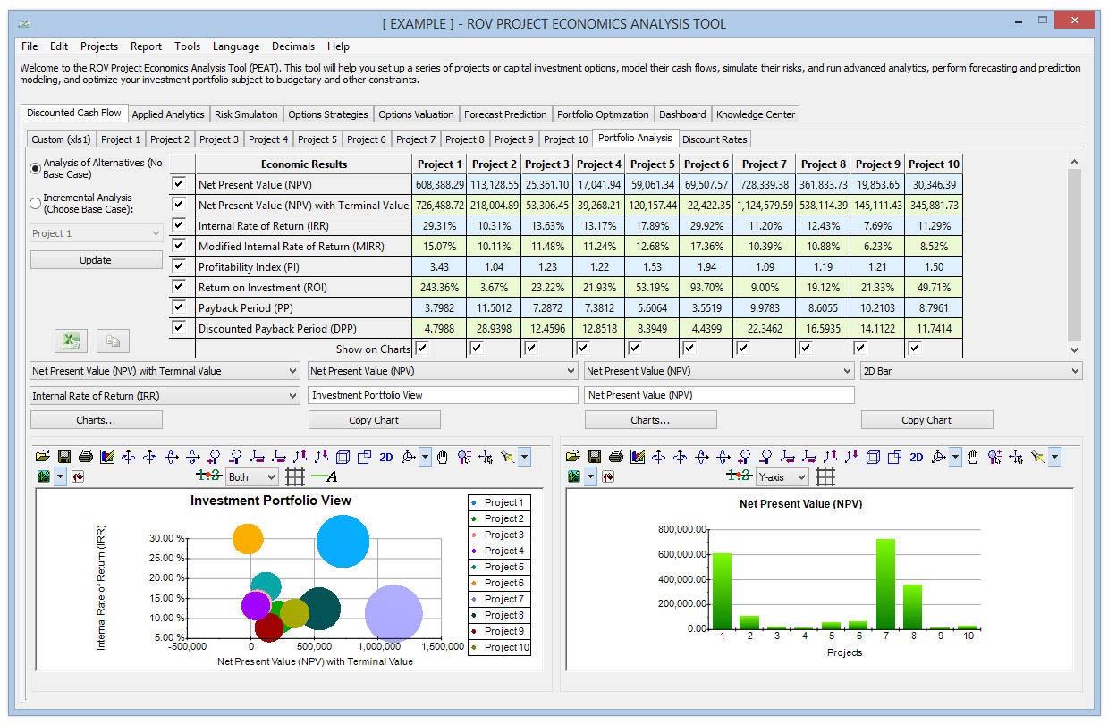
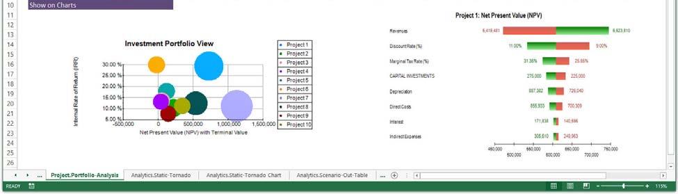
Figure 7 illustrates the Portfolio Analysis of multiple Options. This Portfolio Analysis tab returns the computed economic and financial indicators such as NPV, IRR, MIRR, PI, ROI, PP, and DPP for all the options combined into a portfolio view (these results can be stand‐alone with no base case or computed as incremental values above and beyond the chosen base case). The Economic Results (Level3) subtabs show the individual option’s economic and financial indicators, whereas this Level2 Portfolio Analysis view shows the results of all options’ indicators and compares them side by side. There are also two charts available for comparing these individual options’ results. The Portfolio Analysis tab is used to obtain a side‐by‐side comparison of all the main economic and financial indicators of all the options at once. For instance, users can compare all the NPVs from each option in a single results grid. The bubble chart on the left provides a visual representation of up to three chosen variables at once (e.g., the y‐axis shows the IRR, the x‐axis represents the NPV, and the size of the bubble may represent the capital investment; in such a situation, one would prefer a smaller bubble that is in the top right quadrant of the chart). These charts have associated icons that can be used to modify their settings (chart type, color, legend, etc.).
Custom Modeling
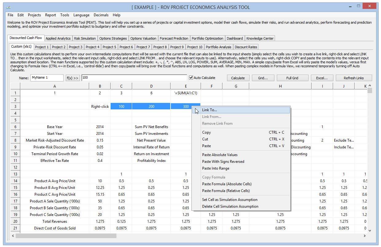
Figure 8 illustrates the Custom calculation tab also available for making the user’s own custom calculations just as they would in a Microsoft Excel spreadsheet. Clicking on the Function F(x) button will provide users with a list of the supported functions that can be used in this tab. A manual Update Calculations can be clicked to update the worksheet’s calculations. Other basic mathematical functions are also supported, such as =, +, ‐, /, *, ^. If users use this Custom calculations tab and wish to link some cells to the other option input tabs (e.g., Option 1), they can select the cells in the Custom calculations tab, right‐click, and select Link To. Then they would proceed to the location in the option tabs and highlight the location of the input cells they wish to link to, right‐click, and select Link From. Any subsequent changes users make in the Custom calculations tab will be updated in the linked input assumption cells.
Procedures
The following are some additional procedural notes on using the Custom tab:
- Simple Paste. Copy information from Microsoft Excel or other software into the Custom tab’s data grid, then paste into the Custom tab and the values and text will be pasted. Only values will be pasted into the grid and cell formatting is not supported in the Custom tab. Users can click Ctrl+V to paste or right‐click and select the various paste options (simple paste, pasting absolute values, pasting reversed signed values, etc.).
- CTRL~. If the actual model and equations in Excel need to be pasted into the Custom tab data grid, when in Excel, first hit Ctrl~ (control button with the tilde, ~, button) to change the Excel worksheet into an equation view mode. Then select the model and paste into the data grid. This way the existing models andcomputations in the worksheet will be transferred into the Custom tab. Be aware that not all Excel functions are supported, so it is recommended that simple equations and basic functions be used and equation linking be restricted to the current worksheet (links across worksheet are not supported).
- Naming Cells. Select one or multiple cells, then type in a cell name (top left corner of the Custom tab) and hit enter. The cells will be named (multiple cells selected means the names will be indexed: Name 1, Name 2, Name 3, etc.) and the names will come in handy when Tornado, Set Simulation Assumptions, and Scenario Analysis are run to identify the input variables. Note that the cell names are not usable as equations in the Custom tabs themselves, only outside of these tabs.
- Excel Links. Live Excel links can also be created such that any changes to these Excel files can be modified and saved, and when PEAT opens, the links will be updated.
- Insert Function F(X). The icon shows the list of functions supported in the Custom tab.
- Auto Calculate. When pasting a large live model (while using the CTRL~ mode), users can temporarily uncheck and disable this feature, then paste the model, and then re‐enable the checkbox. This procedure speeds up the copy/paste process.
- Right‐Click Linking. Users can use the Custom tab as a scratch calculation area, and model outcomes can be selected and linked to the other option tabs. This way, any changes to the Custom tab or simulations run on any values in the Custom tab can be computed and linked to the option tabs.
- Right‐Click Set Simulation Assumption. Non‐equation numerical input values can be set as simulation assumptions. These assumptions will be visible in the Set Input Assumptions tab later to create simulation inputs.
- Right‐Click Custom Headers. Users can add multiple additional Custom tabs and delete, rename, or move existing Custom tabs.
- Refresh Links. Allows users to manually update the external Excel links.
As an illustrative example, in the Custom calculations tab, a user may enter the following: 1, 2, 3 into cells A1, B1, C1, respectively. Then in cell D1, enter =A1+B1+C1 and click on any other cell and it will update the cell and return the value 6. Similarly, users type in =SUM(A1:C1) to obtain the same results. A list of preset functions can be seen by clicking on the F(x) the button. As another example, in the Custom calculations tab, a user may enter the following: 1, 2, 3 into cells A1, B1, C1, respectively. Then, select these three cells, right‐click, and select Link To. Proceed to any one of the option tabs, and in the Discounted Cash Flow or Input Assumptions subtabs, select three cells across (e.g., on the Revenue line item), right‐click, and select Link From. The values of cells A1, B1, C1 in the Custom Calculations tab will be linked to this location. Users can go back to the Custom Calculations tab to change the values in the original three cells and they will see the linked cells in the Discounted Cash Flow or Input Assumptions subtabs change and update to reflect the new values.
Weighted Average Cost of Capital
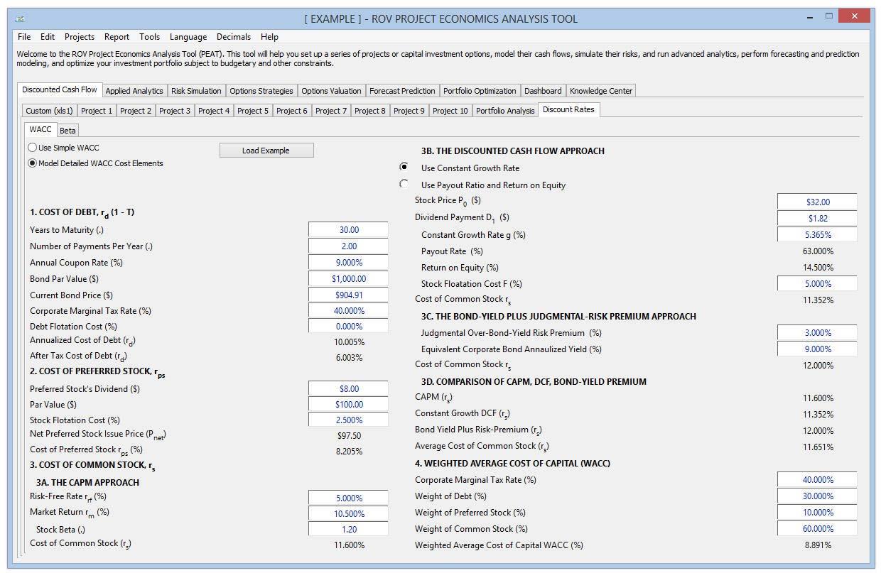
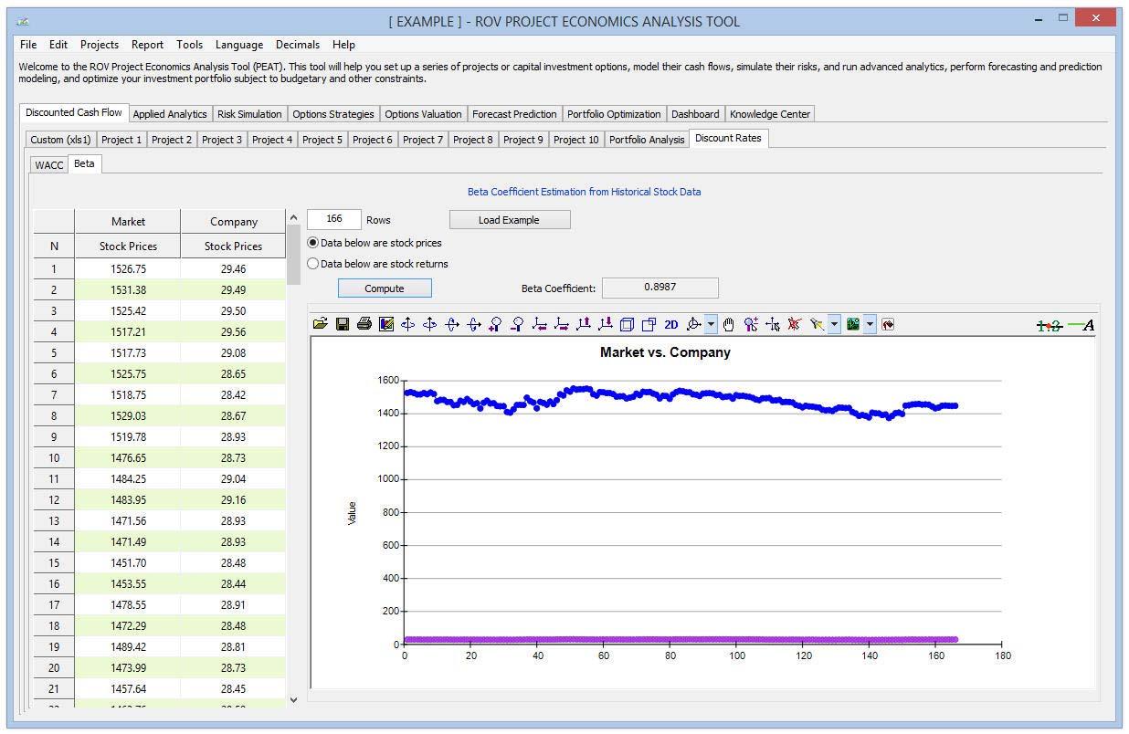
Figure 9 illustrates the Discount Rate tab where the Weighted Average Cost of Capital, or WACC, calculations are housed. This is an optional set of analytics whereby users can compute the firm’s WACC to use as a discount rate. Users start by selecting either the Simple WACC or Detailed WACC Cost Elements. Then, they can either enter the required inputs or click on the Load Example button to load a sample set of inputs that can then be used as a guide to entering their own set of assumptions and additional settings. Figure 10 illustrates the Beta calculations. This is another optional subtab used for computing the beta risk coefficient by pasting in historical stock prices or stock returns to compute the beta, and a time‐series chart provides a visual for the data entered. The resulting beta is used in the Capital Asset Pricing Model (CAPM), one of the main inputs into the WACC model. Users start by selecting whether they have historical Stock Prices or Stock Returns, then enter the number of rows or periods of historical data they have, and paste the data into the relevant columns and click Compute. Users can also click on Load Example to open a sample data set. The beta coefficient result will update and users can use this beta as an input into the WACC model.
Applied Analytics: Tornado and Scenario
Figure 11 illustrates the Applied Analytics section, which allows users to run Tornado Analysis and Scenario Analysis on any one of the options previously modeled––this analytics tab is on Level 1, which means it covers all of the various options on Level 2. Users can, therefore, run tornado or scenario analyses on any one of the options. Tornado analysis, as we already know, is a static sensitivity analysis of the selected model’s output to each input assumption, performed one at a time, and ranked from most impactful to the least. Users start the analysis by first choosing the output variable to test from the droplist.
Procedure
Users can change the default sensitivity settings of each input assumption to test and decide how many input variables to chart (large models with many inputs may generate unsightlyand less useful charts, whereas showing just the top variables reveals more information through a more elegant chart). Users can also choose to run the input assumptions as unique inputs, group them as a line item (all individual inputs on a single line item are assumed to be one variable), or run as variable groups (e.g., all line items under Revenue will be assumed to be a single variable). Users will need to remember to click Compute to update the analysis if they make any changes to any of the settings. The sensitivity results are also shown as a table grid at the bottom of the screen (e.g., the initial base value of the chosen output variable, the input assumption changes, and the resulting output variable’s sensitivity results). The following summarizes the tornado analysis chart’s main characteristics:
- Each horizontal bar indicates a unique input assumption that constitutes a precedent to the selected output variable.
- The x‐axis represents the values of the selected output variable. The wider the bar chart, the greater the impact/swing the input assumption has on the output.
- A green bar on the right indicates that the input assumption has a positive effect on the selected output (conversely, a red bar on the right indicates a negative effect).
- Each of the precedent or input assumptions that directly affect the NPV with Terminal Value is tested ±10% by default (this setting can be changed); the top 10 variables are shown on the chart by default (this setting can be changed), with a 2‐ decimal precision setting; and each unique input is tested individually.
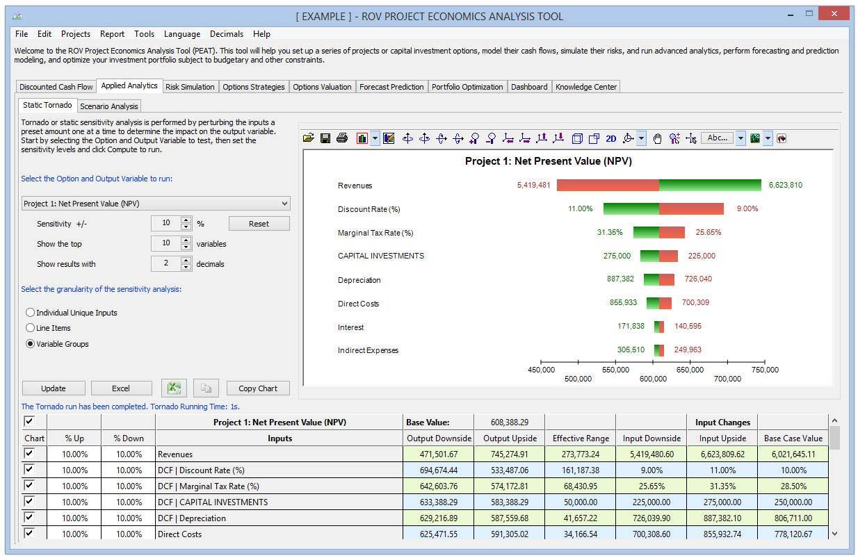
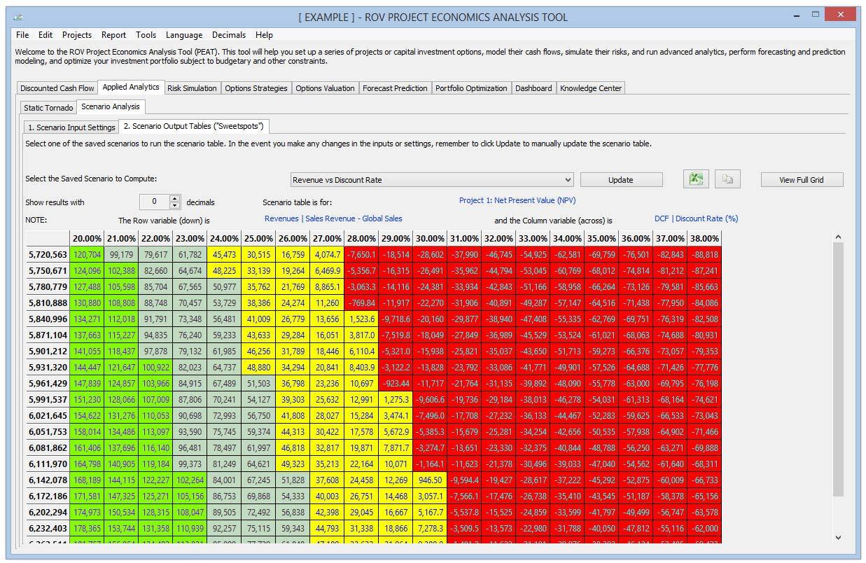
Figure 12 illustrates the Scenario Analysis tab, where the scenario analysis can be easily performed through a two‐step process: identify the model input settings and run the model to obtain scenario output tables. In the Scenario Input Settings subtab, users start by selecting the output variable they wish to test from the droplist. Then, based on the selection, the precedents of the output will be listed under two categories (Line Item, which will change all input assumptions in the entire line item in the model simultaneously, and Single Item, which will change individual input assumption items). Users select one or two checkboxes at a time and the inputs they wish to run scenarios on, and enter the plus/minus percentage and the number of steps between these two values to test. Users can also add color coding of sweetspots or hotspots in the scenario analysis (values falling within different ranges have unique colors). Users can create multiple scenarios and Save As each one (enter a name and model notes for each saved scenario).
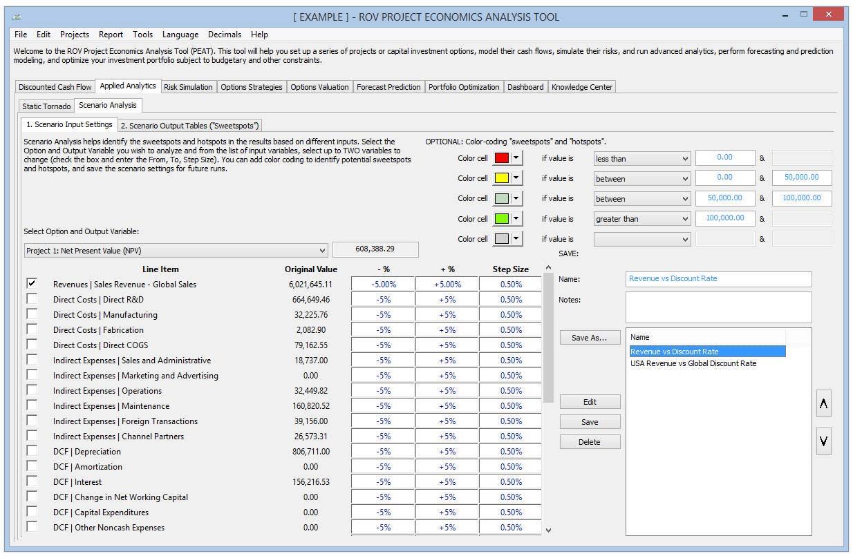
Figure 13 illustrates the Scenario Output Tables to run the saved Scenario Analysis models. Users click on the droplist to select the previously saved scenarios to Update and run. The selected scenario table complete with sweetspot/hotspot color coding will be generated. Decimals can be increased or decreased as required, and users can Copy Grid or View Full Grid as needed. The following are some notes on using the scenario analysis methodology:
- Create and run scenario analysis on either one or two input variables at once.
- The scenario settings can be saved for retrieval in the future, which means users can modify any input assumptions in the options models and come back to rerun the saved scenarios.
- Increase/decrease decimals in the scenario results tables, as well as change colors in the tables for easier visual interpretation (especially when trying to identify scenario combinations, or so‐called sweetspots and hotspots).
- Additional input variables are available by scrolling down the form.
- Line Items can be changed using ±X% where all inputs in the line are changed multiple times within this specific range all at once. Individual Items can be changed ±Y units where each input is changed multiple times within this specific range.
- Sweetspots and hotspots refer to specific combinations of two input variables that will drive the output up or down. For instance, suppose investments are below a certain threshold and revenues are above a certain barrier. The NPV will then be in excess of the expected budget (the sweetspots, perhaps highlighted in green). Or if investments are above a certain value,NPV will turn negative if revenues fall below a certain threshold (the hotspots, perhaps highlighted in red).
Monte Carlo Risk Simulation
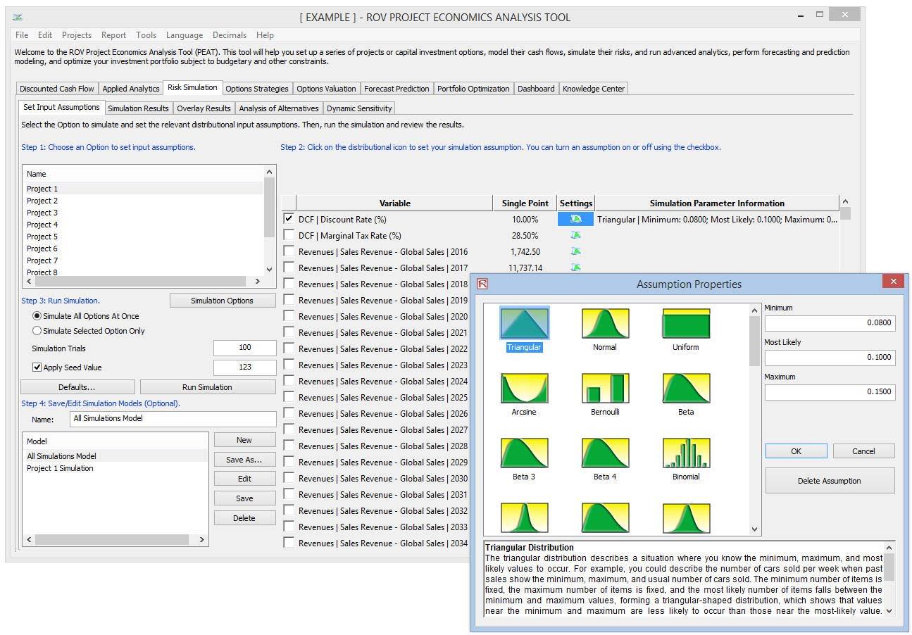
Figure 14 illustrates the Risk Simulation section, where Monte Carlo risk simulations can be set up and run. Users can set up probability distribution assumptions on any combinations of inputs, run a risk simulation tens to hundreds of thousands of trials, and retrieve the simulated forecast outputs as charts, statistics, probabilities, and confidence intervals in order to develop comprehensive risk profiles of the options.
Procedure
In the Set Input Assumptions subtab, users start the simulation analysis by first setting simulation distributional inputs here (assumptions can be set to individual input assumptions in the model or as an entire line item). Users click on and choose one option at a time to list the available input assumptions. Users then click on the probability distribution icon under the Settings header for the relevant input assumption row, select the probability distribution to use, and enter the relevant input parameters. Users continue setting as many simulation inputs as required (users can check/uncheck the inputs to simulate). Users then enter the simulation trials to run (it is suggested to start with 1,000 as initial test runs and use 10,000 for the final run as a rule of thumb for most models). Users can also Save As the model (remembering to provide it a name). Then they click on Run Simulation. Finally, in this tab, users can set simulation assumptions across multiple options and Simulate All Options at Once, apply a Seed Value to replicate the exact simulation results each time it is run, and Edit or Delete a previously saved simulation model. Although the software supports up to 50 probability distributions, in general, the most commonly used and applied distributions include Triangular, Normal, and Uniform. If the user has historical data available, he or she can use the Forecast Prediction (discussed in a later section) tab to perform a Distributional Fitting to determine the best‐fitting distribution to use as well as to estimate the selected distribution’s input parameters. Multiple simulation settings can be saved such that they can be retrieved, edited, and modified as required in the future. Users can select either Simulate All Options at Once or Simulate Selected Option Only, depending on whether they wish to run a risk simulation on all the options that have predefined simulation assumptions or to run a simulation only on the current option that is selected.
Simulation Results, Confidence Intervals, and Probabilities
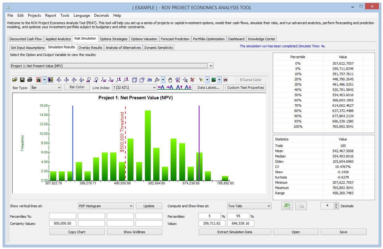
Figure 15 illustrates the Risk Simulation Results subtab. After the simulation completes its run, the utility will automatically take the user to the Simulation Results tab. The user selects the output variable to display using the droplist. The simulation forecast chart is shown on the left, while percentiles and simulation statistics are presented on the right.
Procedure
Users can change and update the chart type (e.g., PDF, CDF), enter Percentiles (in %) or Certainty Values (in output units) on the bottom left of the screen (remembering to click Update when done) to show their vertical lines on the chart, or compute/show the Percentiles/Confidence levels on the bottom right of the screen (selecting the type: Two Tail, Left Tail, Right Tail, then either entering the percentile values to auto‐compute the confidence interval or entering the confidence desired to obtain the relevant percentiles). Users can also Save the simulated results and Open them at a later session, Extract Simulation Data to paste into Microsoft Excel for additional analysis, modify the chart using the chart icons, and so forth. The simulation forecast chart is highly flexible in the sense that users can modify its look and feel (color, chart type, background, gridlines, rotation, chart view, data labels, etc.) using the chart icons. If users entered either a percentile or certainty value at the bottom left of the screen and clicked Update, they can then click on custom text properties in the chart icon, select the Vertical Line, type in some custom texts, click on the Properties button to change the font size/color/type, or use the icons to move the custom text’s location. Users can also enter in custom percentile or numerical values to show in the chart. As a side note, this Simulation Results forecast chart shows one output variable at a time, whereas the Overlay Results compares multiple simulated output forecasts at once.
Probability Distribution Overlay Charts
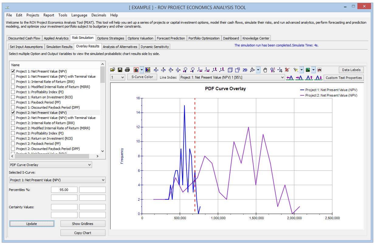
Figure 16 illustrates the Overlay Results tab. Multiple simulation output variables can be compared at once using the overlay charts. Users simply check/uncheck the simulated outputs they wish to compare and select the chart type to show (e.g., S‐Curves, CDF, PDF). Users can also add percentile or certainty lines by first selecting the output chart, entering the relevant values, and clicking the Update button. As usual, the generated charts are highly flexible in that users can modify them using the included chart icons (as well as whether to show or hide gridlines) and the chart can be copied into the Microsoft Windows clipboard for pasting into another software application. Typically, S‐curves of CDF curves are used in overlay analysis when comparing the risk profile of multiple simulated forecast results.
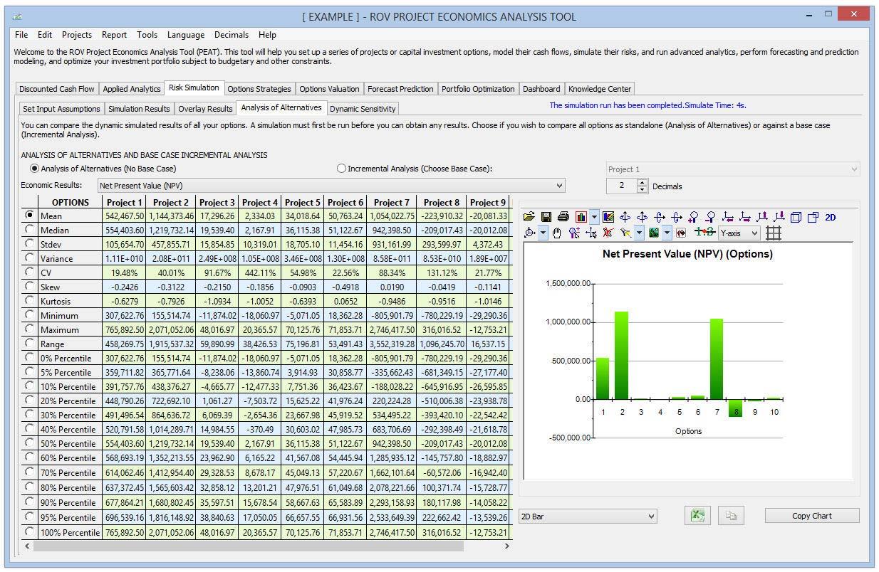
Analysis of Alternatives
Figure 17 illustrates the Analysis of Alternatives subtab. Whereas the Overlay Results subtab shows the simulated results as charts (PDF/CDF), the Analysis of Alternatives subtab shows the results of the simulation statistics in a table format as well as a chart of the statistics such that one option can be compared against another. The default is to run an analysis of alternatives to compare one option versus another, but users can also choose the Incremental Analysis option (remembering to choose the desired economic metric to show, its precision in terms of decimals, the Base Case option to compare the results to, and the chart display type).
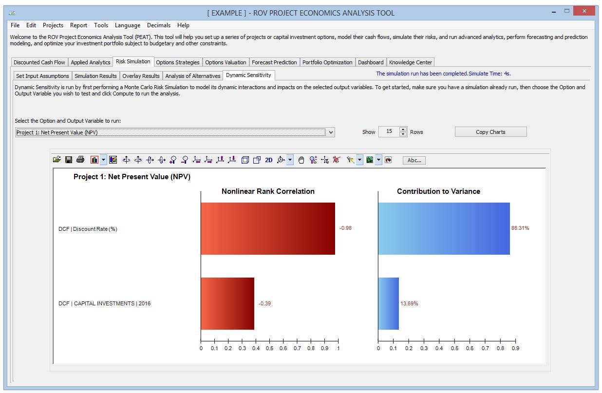
Dynamic Sensitivity Analysis
Figure 18 illustrates the Dynamic Sensitivity Analysis computations. Tornado analysis and scenario analysis are both static calculations. Dynamic sensitivity, in contrast, is a dynamic analysis, which can only be performed after a simulation is run. Users start by selecting the desired option’s economic output. Red bars on the Rank Correlation chart indicate negative correlations and green bars indicate positive correlations for the left chart. The correlations’ absolute values are used to rank the variables with the highest relationship to the lowest, for all simulation input assumptions. The Contribution to Variance computations and chart indicate the percentage fluctuation in the output variable that can be statistically explained by the fluctuations in each of the input variables. As usual, these charts can be copied and pasted into another software application.
Strategic Real Options Analysis
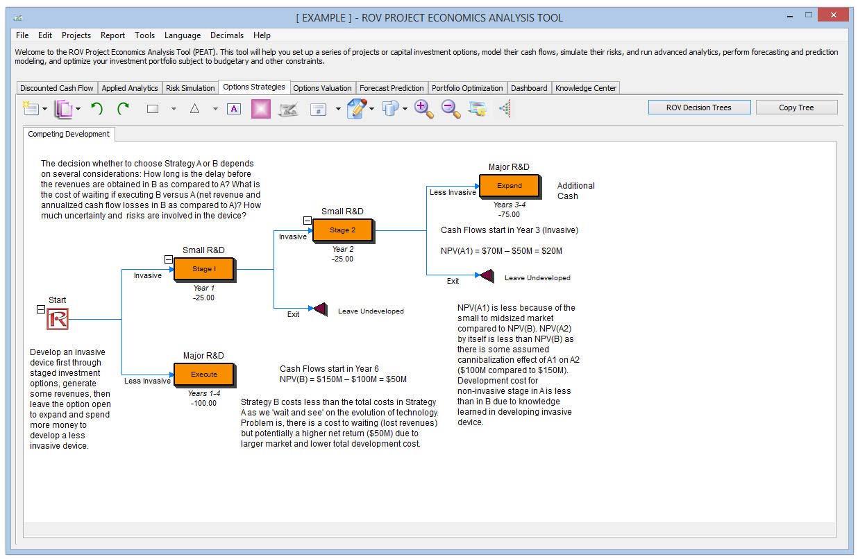
Figure 19 illustrates the Options Strategies tab. Options Strategies is where users can draw their own custom strategic maps, and each map can have multiple strategic real options paths. This section allows users to draw and visualize these strategic pathways and does not perform any computations. (The next section, Options Valuation, actually performs the computations.) Users can explore this section’s capabilities, but viewing the Video on Options Strategies (see Figure 30 for the Knowledge Center videos) to quickly get started on using this very powerful tool is recommended.
Procedure
Users can also explore some preset options strategies by clicking on the first icon and selecting any one of the examples (click on the first icon and select Examples). Below are details on this Options Strategies tab:
- Users can Insert Option nodes or Insert Terminal nodes by first selecting any existing node and then clicking on the option node icon (square) or terminal node icon (triangle).
- Users can modify individual Option Node or Terminal Node properties by double‐clicking on a node. Sometimes when users click on a node, all subsequent child nodes are also selected (this allows users to move the entire tree starting from that selected node). If users wish to select only that node, they may have to click on the empty background and click back on that node to select it individually. Also, users can move individual nodes or the entire tree starting from the selected node depending on the current setting (right‐click, or in the Edit menu, select Move Nodes Individually or Move Nodes Together).
- The following are some quick descriptions of the things that can be customized and configured in the node properties user interface. It is simplest for the user to try different settings for each of the following to see its effects in the Strategy Tree.
- Name. Name shown above the node.
- Value. Value shown below the node.
- Excel Link. Links the value from an Excel spreadsheet’s cell.
- Notes. Notes can be inserted above or below a node.
- Show in Model. Show any combinations of Name, Value, and Notes
- Local Color versus Global Color. Node colors can be changed locally to a node or globally.
- Label Inside Shape. Text can be placed inside the node (users may need to make the node wider to accommodate longer text).
- Branch Event Name. Text can be placed on the branch leading to the node to indicate the event leading to this node.
- Select Real Options. A specific real option type can be assigned to the current node. Assigning real options to nodes allows the tool to generate a list of required input variables.
- Global Elements are all customizable, including elements of the Strategy Tree’s Background, Connection Lines, Option Nodes, Terminal Nodes, and Text Boxes. For instance, the following settings can be changed for each of the elements:
- Font settings on Name, Value, Notes, Label, and Event names.
- Node Size (minimum and maximum height and width).
- Borders (line styles, width, and color).
- Shadow (colors and whether to apply a shadow or not).
- Global Color.
- Global Shape.
- Example Files are available in the first icon menu to help users get started on building Strategy Trees.
- Protect File from the first icon menu allows the Strategy Tree and the entire PEAT model to be encrypted with up to a 256‐bit password encryption. Care must be taken when a file is being encrypted because if the password is lost, the file can no longer be opened.
- Capturing the screen or printing the existing model can be done through the first icon menu. The captured screen can then be pasted into other software applications.
- Add, Duplicate, Rename, and Delete a Strategy Tree can be performed through right‐clicking the Strategy Tree tab or the Edit menu.
- Users can also Insert File Link and Insert Comment on any option or terminal node, or Insert Text or Insert Picture anywhere in the background or canvas area.
- Users can Change Existing Styles or Manage and Create Custom Styles of their Strategy Tree (this includes size, shape, color schemes, and font size/color specifications of the entire Strategy Tree).
Real Options Valuation Modeling
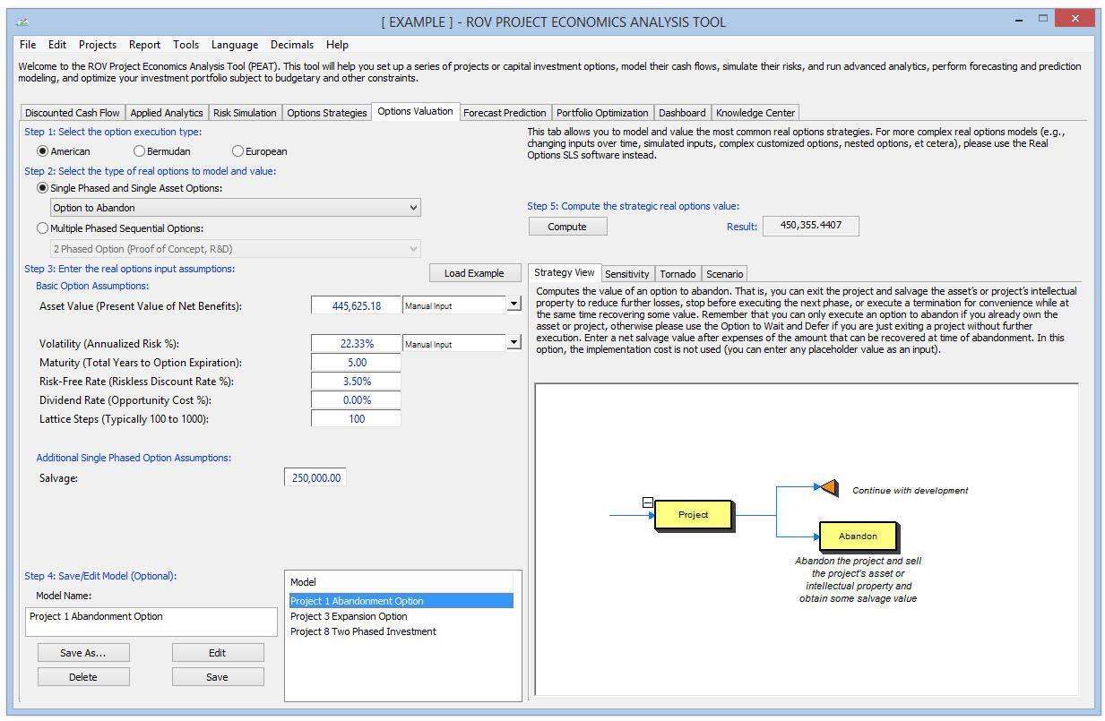
Figure 20 illustrates the Options Valuation tab and the Strategy View. This section performs the calculations of real options valuation models. Users must understand the basic concepts of real options before proceeding. This Options Valuation tab internalizes the more sophisticated Real Options SLS software as described and explained in Chapter 13 of Modeling Risk, Third Edition. Instead of requiring more advanced knowledge of real options analysis and modeling, users can simply choose the real option types, and the required inputs will be displayed for entry. Users can compute and obtain the real options value quickly and efficiently, as well as run the subsequent tornado, sensitivity, and scenario analyses.
Procedure
Users start by choosing the option execution type (e.g., American, Bermudan, or European), selecting an option to model (e.g., single phased and single asset or multiple phased sequential options), and, based on the option types selected, entering the required inputs and clicking Compute to obtain the results. Users can also click on the Load Example to load preset input assumptions based on the selected option type and option model. Some basic information and a sample strategic path are shown on the right under the Strategy View. Also, a tornado analysis and scenario analysis can be performed on the option model and users can Save As, Delete, or Edit existing saved models. The Sensitivity Analysis subtab runs a static sensitivity table of the real options model based on updated user inputs and settings. The Tornado Analysis subtab develops the tornado chart of the real options model. The interpretation of this tornado chart is identical to those previously described. The Scenario Analysis subtab runs a scenario table of the real options model based on updated user settings (input variables to analyze as well as the range and amount to perturb).
Stochastic Forecasting and Prediction Modeling
Figure 21 illustrates the Forecast Prediction module. This is a sophisticated business analytics and business statistics module with over 150 functionalities. The user starts by entering the data in Step 1’s data grid (user can copy and paste from Microsoft Excel or other ODBC‐compliant data source, manually type in data, or click on the Options | Example button to load a sample dataset complete with previously saved models). The user then chooses the analysis to perform in Step 2 and, using the variables list provided, enters the desired variables to model given the chosen analysis (if users previously clicked Example, users can double‐click to use and run the saved models in Step 4 to see how variables are entered in Step 2, and use that as an example for their analysis). The user then clicks Run in Step 3 when ready to obtain the results, charts, and statistics of the analysis that can be copied and pasted to another software application. Users can alternatively Save or Edit/Delete their models in Step 4 by giving them a name for future retrieval from a list of saved models, which can be sorted or rearranged accordingly. Users may also explore the power of this forecasting module by loading the preset Example, or they can watch the Getting Started Videos (see Figure 30) to quickly get started using the module and review the user manual for more details on the 150 analytical methods.
Procedure
The following steps are illustrative of the Forecast Prediction procedures:
- Users start at the Forecast Prediction tab and click on Example to load a sample data and model profile or type in their data or copy/paste from another software application such as Microsoft Excel or Microsoft Word/text file into the data grid in Step 1. Users can add their own notes or variable names in the first Notes row.
- Users then select the relevant model to run in Step 2 and using the example data input settings, enter in the relevant variables. Users must separate variables for the same parameter using semicolons and use a new line (hit Enter to create a new line) for different parameters.
- Clicking Run will compute the results. Users can view any relevant analytical results, charts, or statistics from the various tabs in Step 3.
- If required, users can provide a model name to save into the profile in Step 4. Multiple models can be saved in the same profile. Existing models can be edited or deleted and rearranged in order of appearance, and all the changes can be saved.
- The data grid size can be set in the Grid Configure button, where the grid can accommodate up to 1,000 variable columns with 1 million rows of data per variable. The pop‐up menu also allows users to change the language and decimal settings for their data.
- In getting started, it is always a good idea to load the example file that comes complete with some data and precreated models. Users can double‐click on any of these models to run them, and the results are shown in the report area, which sometimes can be a chart or model statistics. Using this example file, users can now see how the input parameters are entered based on the model description, and users can proceed to create their own custom models
- Users can click on the variable headers to select one or multiple variables at once, and then right‐click to add, delete, copy, paste, or visualize the variables selected.
- Users can click on the data grid’s column header(s) to select the entire column(s) or variable(s), and once selected, users can right‐click on the header to Auto Fit the column, or to cut, copy, delete, or paste data. Users can also click on and select multiple column headers to select multiple variables and right‐click and select Visualize to chart the data.
- If a cell has a large value that is not completely displayed, the user can click on and hover the mouse over that cell to see a pop‐up comment showing the entire value, or simply resize the variable column (drag the column to make it wider, double‐clickon the column’s edge to auto‐fit the column, or right‐click on the column header and select Auto Fit).
- Users can use the up, down, left, and right keys to move around the grid, or use the Home and End keys on the keyboard to move to the far left and far right of a row. Users can also use combination keys such as Ctrl+Home to jump to the top left cell, Ctrl+End to the bottom right cell, Shift+Up/Down to select a specific area, and so forth.
- Users can enter short, simple notes for each variable on the Notes row.
- Users can try out the various chart icons on the Visualize tab to change the look and feel of the charts (rotate, shift, zoom, change colors, add legend, etc.).
- The Copy button is used to copy the results, charts, and statistics tabs in Step 3 after a model is run. If no models are run, then the copy function will only copy a blank page.
- The Report button will only run if there are saved models in Step 4 or if there are data in the grid; otherwise the report generated will be empty. Users will also need Microsoft Excel to be installed to run the data extraction and results reports, and have Microsoft PowerPoint available to run the chart reports.
- When in doubt about how to run a specific model or statistical method, the user should start the Options | Example profile and review how the data are set up in Step 1 or how the input parameters are entered in Step 2. Users can use these examples as getting started guides and templates for their own data and models.
- Users can click the Options | Example button to load a sample set of previously saved data and models. Then double‐click on one of the Saved Models in Step 4. Users can see the saved model that is selected and the input variables used in Step 2. The results will be computed and shown in the Step 3 results area, and users can view the results, charts, or statistics depending on what is available based on the model they chose and ran.
- Users can select a variable in the data grid by clicking on the header(s). For instance, users can click on VAR1 and it will select the entire variable.
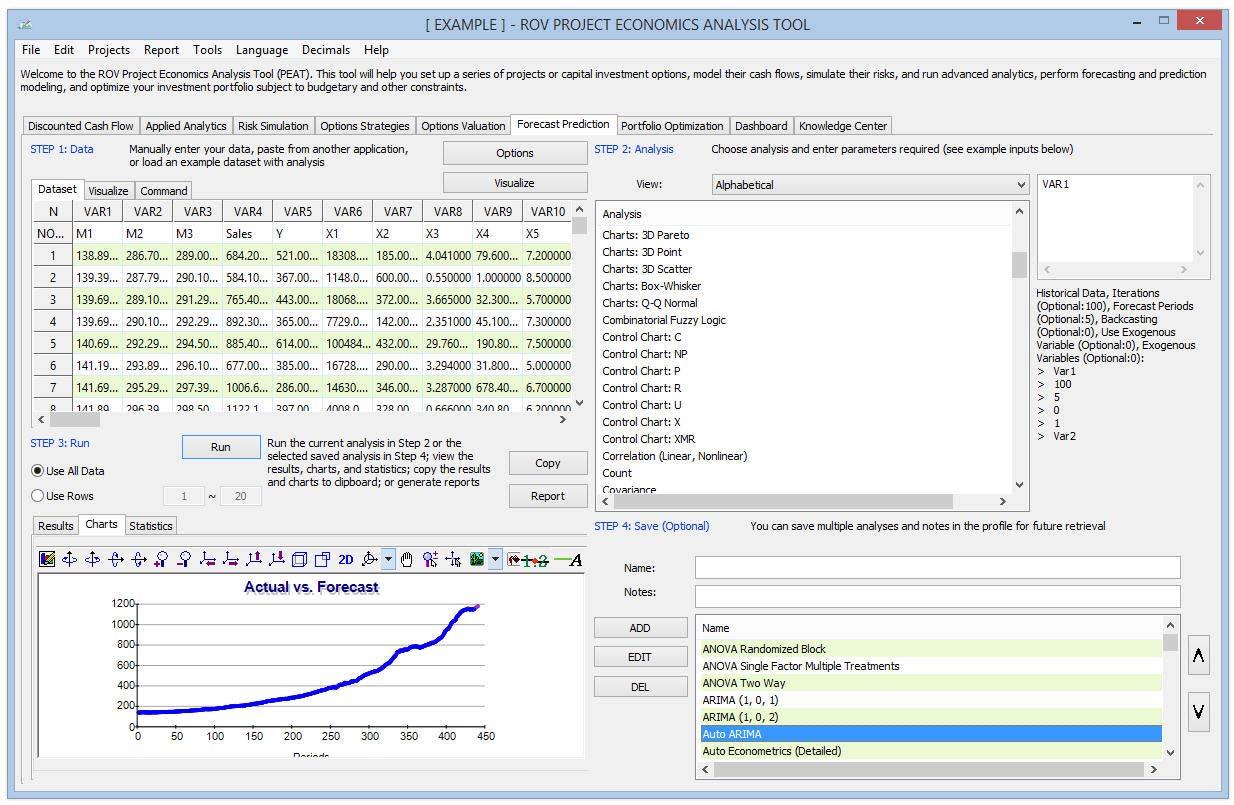
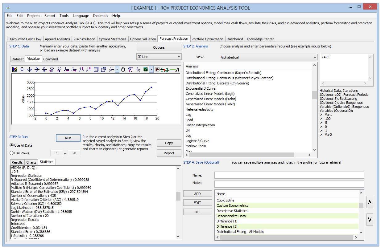
Figure 22 illustrates the forecast prediction’s Visualize and Charts subtabs. Depending on the model run, sometimes the results will return a chart (e.g., a stochastic process forecast was created and the results are presented both in the results and charts subtabs). The charts subtab has multiple chart icons users can use to change the appearance of the chart (modify the chart type, chart line colors, chart view,
etc.). Also, when a variable header in the data grid is selected, users can click on the Visualize button or right‐click and select Visualize, and the data will be collapsed into a time‐series chart.
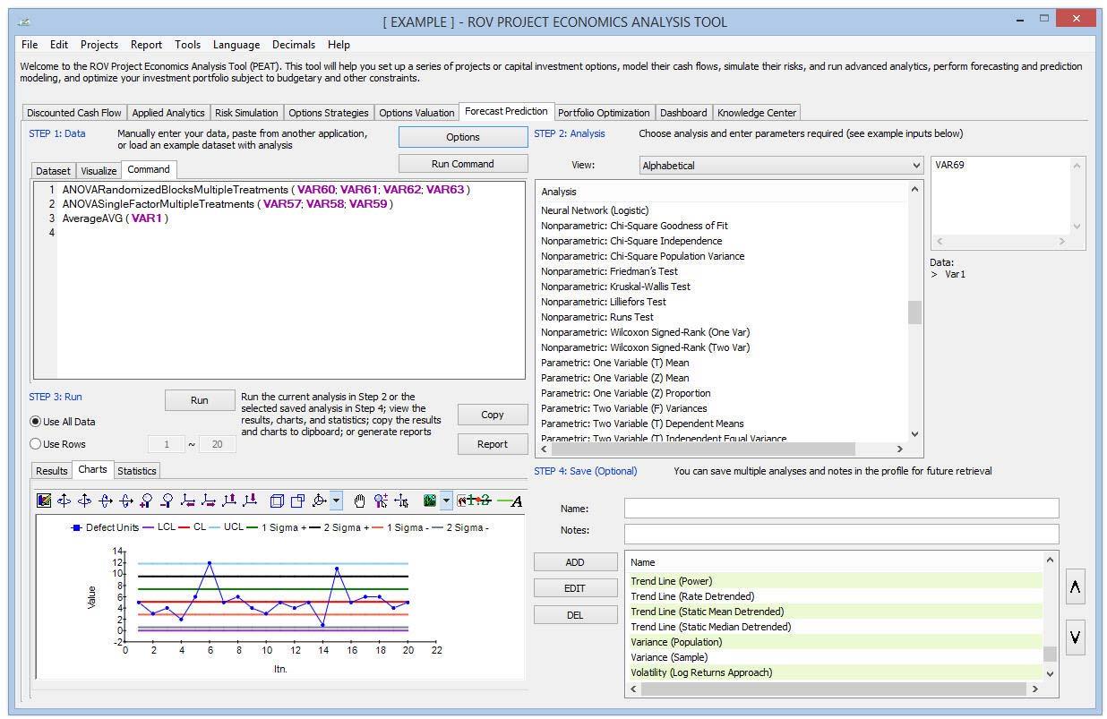
Figure 23 illustrates the forecast prediction’s Command Console. Users can also quickly run multiple models using direct commands here. It is recommended that new users set up the models using the user interface, starting from Step 1 through to Step 4. To start using the console, users create the models they need, then click on the Command subtab, copy/edit/replicate the command syntax (e.g., users can replicate a model multiple times and change some of its input parameters very quickly using the command approach), and when ready, click on the Run Command button. Alternatively, models can also be entered using a console. To see how this works, users can double‐click to run a model and go to the console. Users can replicate the model or create their own and click Run Command when ready. Each line in the console represents a model and its relevant parameters. The figure also shows a sample set of results in the Statistics subtab.
Portfolio Optimization
Figure 24 illustrates the Portfolio Optimization’s Optimization Settings subtab. In the Portfolio Optimization section, the individual options can be modeled as a portfolio and optimized to determine the best combination of projects for the portfolio. In today’s competitive global economy, companies are faced with many difficult decisions. These decisions include allocating financial resources, building or expanding facilities, managing inventories, and determining product‐mix strategies. Such decisions might involve thousands or millions of potential alternatives. Considering and evaluating each of them would be impractical or even impossible. A model can provide valuable assistance in incorporating relevant variables when analyzing decisions and in finding the best solutions for making decisions. Models capture the most important features of a problem and present them in a form that is easy to interpret. Models often provide insights that intuition alone cannot. An optimization model has three major elements: decision variables, constraints, and an objective. In short, the optimization methodology finds the best combination or permutation of decision variables (e.g., which products to sell or which projects to execute) in every conceivable way such that the objective is maximized (e.g., revenues and net income) or minimized (e.g., risk and costs) while still satisfying the constraints (e.g., budget and resources).
The options can be modeled as a portfolio and optimized to determine the best combination of projects for the portfolio in the Optimization Settings subtab. Users start by selecting the optimization method (Static or Dynamic Optimization). Then they select the decision variable type of Discrete Binary (choose which Options to execute with a Go/No‐Go Binary 1/0 decision) or Continuous Budget Allocation (returns % of budget to allocate to each option as long as the total portfolio is 100%); select the Objective (Max NPV, Min Risk, etc.); set up any Constraints (e.g., budget restrictions, number of projects restrictions, or create customized restrictions); select the options to optimize/allocate/choose (default selection is all options); and when completed, click Run Optimization. The software will then take users to the Optimization Results tab.
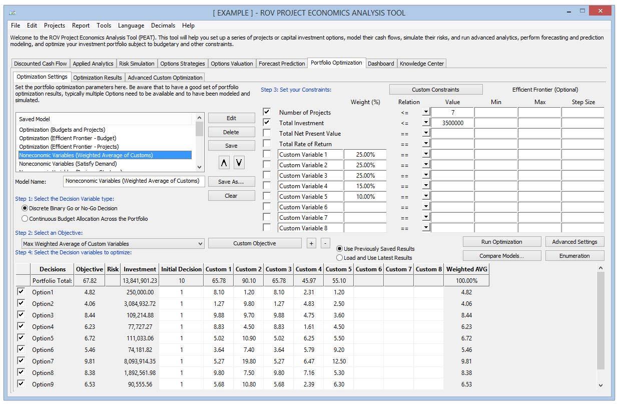
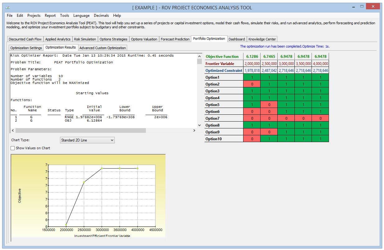
Figure 25 illustrates the Optimization Results tab, which returns the results from the portfolio optimization analysis. The main results are provided in the data grid, showing the final Objective Function results, final Optimized Constraints, and the allocation, selection, or optimization across all individual options within this optimized portfolio. The top left portion of the screen shows the textual details and results of the optimization algorithms applied, and the chart illustrates the final objective function. The chart will only show a single point for regular optimizations, whereas it will return an investment efficient frontier curve if the optional Efficient Frontier settings are set (min, max, step size) in the tab.
Customized Optimization Modeling
Figure 26 illustrates the Advanced Custom Optimization tab’s Optimization Method routines, where users can create and solve their own optimization models. Knowledge of optimization modeling is required to set up models, but users can click on Load Example and select a sample model to run. Users can use these sample models to learn how the optimization routines can be set up. Users click Run when done to execute the optimization routines and algorithms. The calculated results and charts will be presented on completion. When users set up their own optimization model, it is recommended that they go from one tab to another, starting with the Method (Static, Dynamic, or Stochastic Optimization) and based on the selected method, input the simulation seeds or simulation trials, or the number of stochastic optimization iterations to perform. The Optimized Results will be shown after the model is run, where the resulting optimized decision variables are presented as a data grid. Perhaps the best way to get started for a new user is to load an existing set of example models to run. The user’s own custom model can be checked using the Verify process to determine if the model is set up correctly.
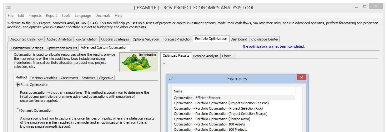
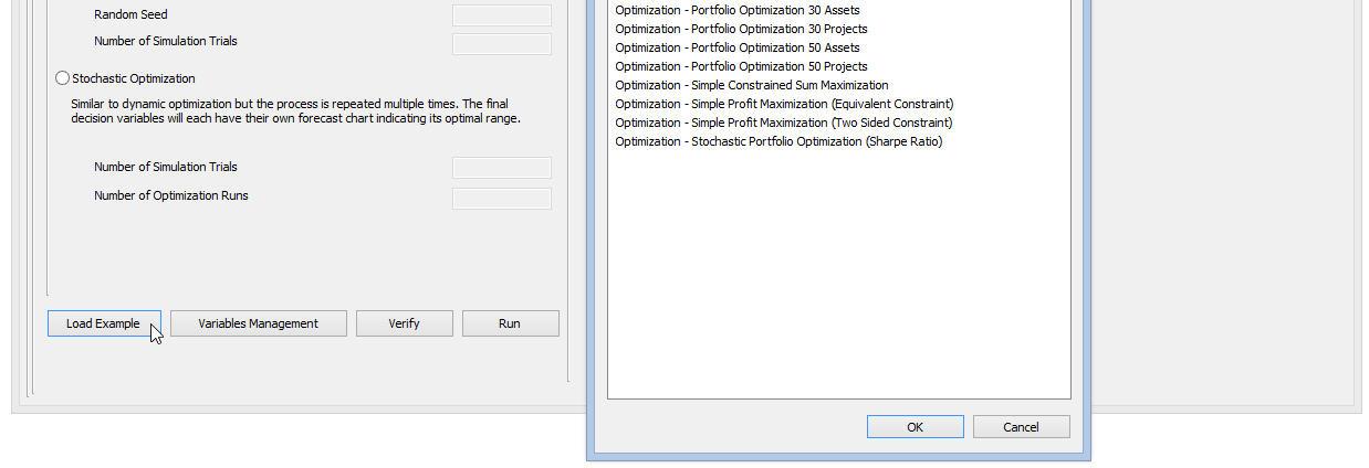
Figure 27 illustrates the Advanced Custom Optimization’s Decision Variables setup, where decision variables are those quantities over which users have control; for example, the amount of a product to make, the number of dollars to allocate among different investments, or which projects to select from among a limited set. As an illustrative example, portfolio optimization analysis includes a go or no‐go decision on particular projects. In addition, the dollar or percentage budget allocation across multiple projects also can be structured as decision variables. Users can click Add to add a new Decision Variable. Users can also Change, Delete, or Duplicate an existing decision variable. The Decision Variables can be set as Continuous (with lower and upper bounds), Integers (with lower and upper bounds), Binary (0 or 1), or a Discrete Range. The list of available variables is shown in the data grid, complete with their assumptions (rules, types, starting values). Users can view the Detailed Analysis of the optimization results.
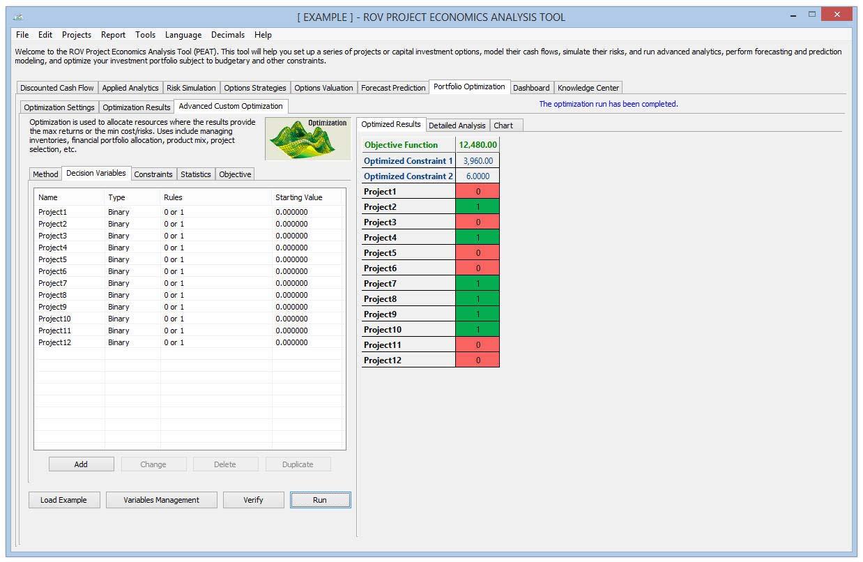
Figure 28 illustrates the Advanced Custom Optimization’s Constraints setup,which describes relationships among decision variables that restrict the values of the decision variables. For example, a constraint might ensure that the total amount of money allocated among various investments cannot exceed a specified amount or, at most, one project from a certain group can be selected; budget constraints; timing restrictions; minimum returns; or risk tolerance levels. Users can add a new constraint, and change or delete existing constraints. When adding a new constraint, the list of available Variables will be shown. Users can simply double‐click on a desired variable and its variable syntax will be added to the Expression window. For example, double‐clicking on a variable named “Return1” will create a syntax variable “$(Return1)$” in the window. Users can enter their own constraint equation(s). For example, the following is a constraint: $(Asset1)$+$(Asset2)$+$(Asset3)$+$(Asset4)$=1 where the sum of all four decision variables must add up to 1. Users can keep adding as many constraints as needed without any upper limit. The optimization results on occasion will also return a chart, for example, when an investment efficient frontier (Modern Portfolio Theory) is modeled in the optimization routines. Additional chart functionalities are available in the charts.
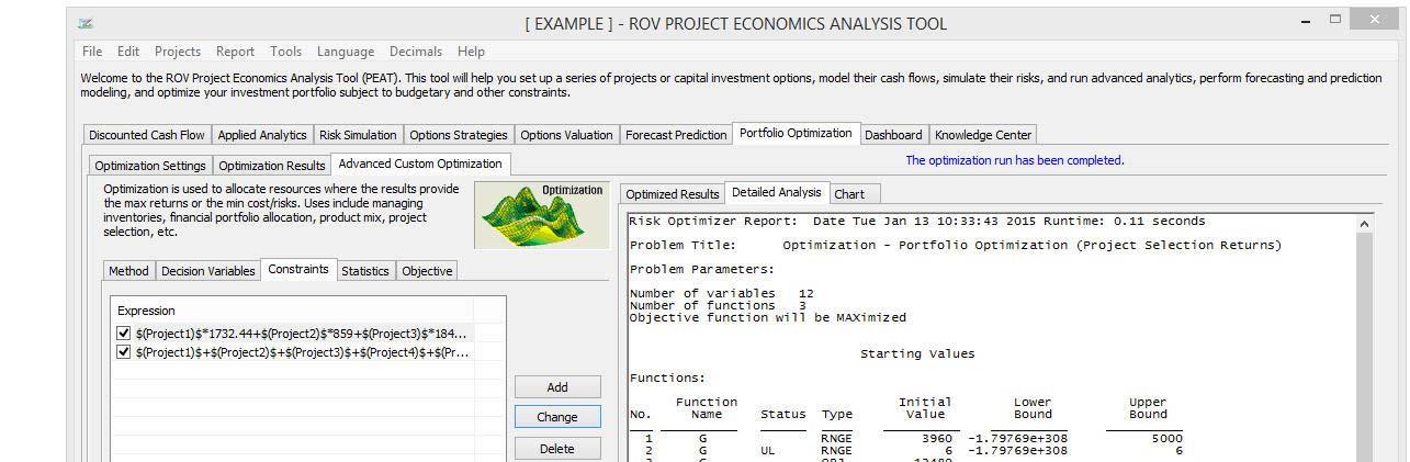
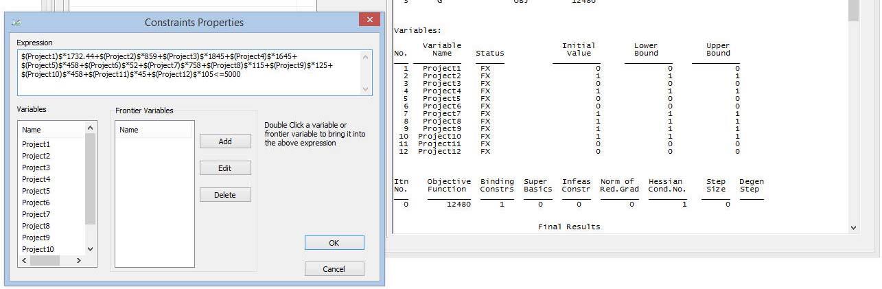
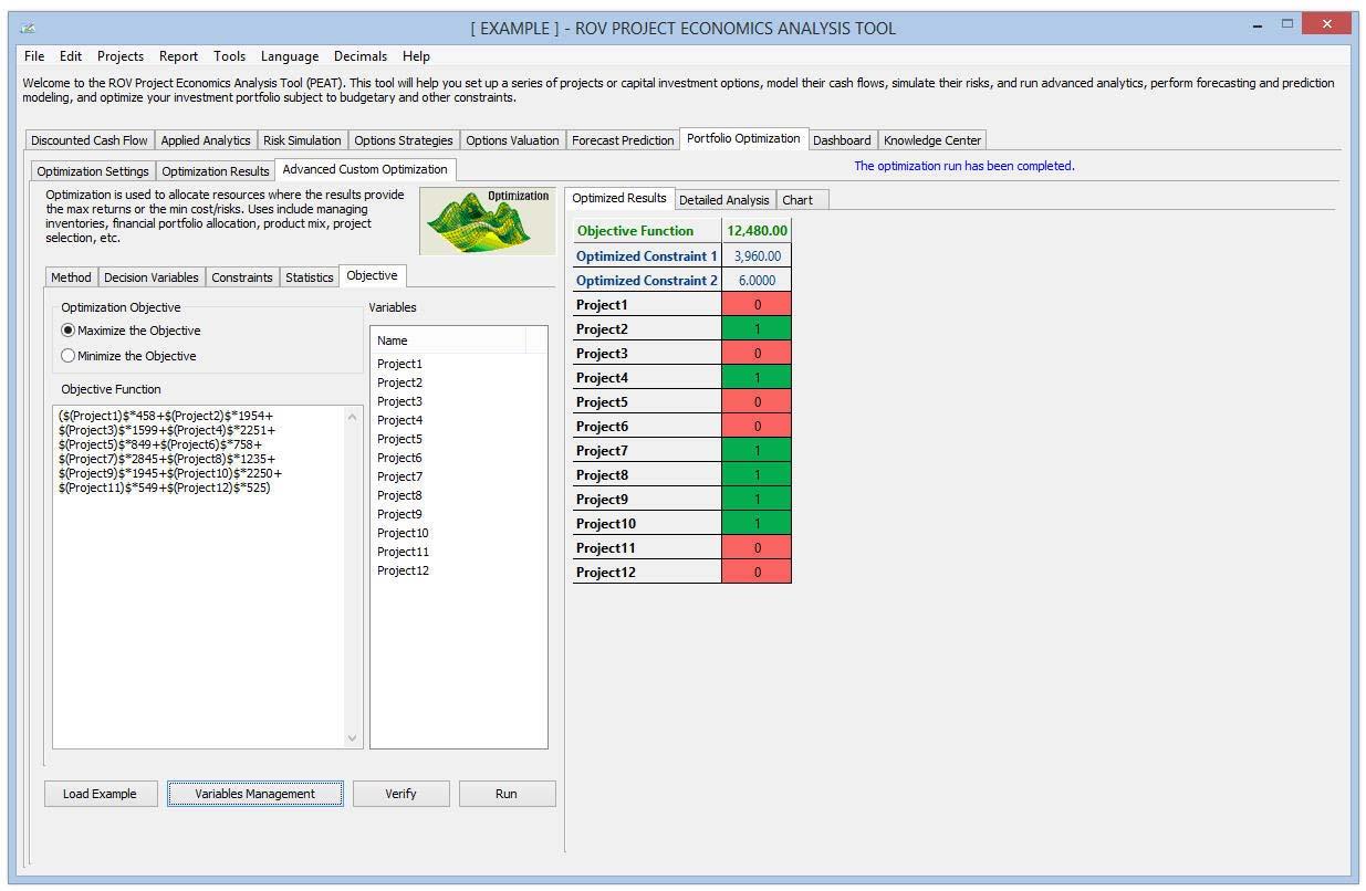
Figure 29 illustrates the Advanced Custom Optimization’s Objective, which provides a mathematical representation of the model’s desired outcome, such as maximizing profit or minimizing cost, in terms of the decision variables. In financial analysis, for example, the objective may be to maximize returns while minimizing risks (maximizing the Sharpe’s ratio or returns‐to‐risk ratio). Users can enter their own customized objective in the function window. The list of available variables is shown in the Variables window on the right. This list includes predefined decision variables and simulation assumptions. An example of an objective function equation looks something like:
($(Asset1)$*$(AS_Return1)$+$(Asset2)$*$(AS_Return2)$+$(Asset3)$*$(AS_Return3)$+
$(Asset4)$*$(AS_Return4)$)/sqrt($(AS_Risk1)$**2*$(Asset1)$**2+$(AS_Risk2)$**2*$
(Asset2)$**2+$(AS_Risk3)$**2*$(Asset3)$**2+$(AS_Risk4)$**2*$(Asset4)$**2)
Users can use some of the most common math operators such as +, ‐, *, /, **, where the latter is the function for “raised to the power of.”
The Advanced Custom Optimization’s Statistics subtab will be populated only if there are simulation assumptions set up . The Statistics window will only be populated if users have previously defined simulation assumptions available. If there are simulation assumptions set up, users can run Dynamic Optimization or Stochastic Optimization (Figure 26); otherwise users are restricted to running only Static Optimization. In the window, users can click on the statistics individually to obtain a droplist. Here users can select the statistic to apply in the optimization process. The default is to return the Mean from the Monte Carlo Risk Simulation and replace the variable with the chosen statistic (in this case the average value), and Optimization will then be executed based on this statistic.
Knowledge Center
Figure 30 illustrates the Knowledge Center’s Step‐by‐Step Procedures, where users will find quick getting started guides and sample procedures that are straight to the point to assist them in quickly getting up to speed in using the software. Users click on the Previous and Next buttons to navigate from slide to slide or to view the Getting Started Videos. These sessions are meant to provide a quick overview to help users get started with using PEAT and do not substitute for years of experience or the technical knowledge required in the Certified in Risk Management (CRM) and Certified in Quantitative Risk Management (CQRM) programs. The Step‐by‐Step Procedures section highlights some quick getting started steps in a self‐paced learning environment that is incorporated within the PEAT software. There are short descriptions above each slide, and key elements of the slide are highlighted in the figures for quick identification.
The Knowledge Center’s Basic Project Economics Lessons section provides an overview tour of some common concepts involved with cash‐flow analysis and project economic analysis such as the computations of NPV, IRR, MIRR, PI, ROI, PP, DPP, and so forth. In addition, the Knowledge Center’s Getting Started Videos subtab is where users can watch a short description and hands‐on examples of how to run one of the sections within this PEAT software. The first quick getting started video is preinstalled with the software while the rest of the videos may be downloaded at first viewing. Before downloading any materials, users should ensure they have a good Internet connection to view the online videos. The videos may be entirely preinstalled or entirely downloadable.
The Knowledge Center has additional functionalities that users can customize. The Knowledge Center files (videos, slides, and figures) may be available in the installation path’s three subfolders: Lessons, Videos, and Procedures. Users can access the raw files directly or modify/update these files and the updated files will show in the software tool’s Knowledge Center the next time the software utility tool is started. Users can utilize the existing files (e.g., file type such as *.BMP or *.WMV as well as pixel size of figures) as a guide to the relevant file specifications they can use when replacing any of these original Knowledge Center files. If users wish to edit the text shown in the Knowledge Center, they can edit the *.XML files in the three subfolders, and the next time the software tool is started, the updated text will be shown. This file format is small in size and, hence, more portable when implementing it in the PEAT software tool installation build, such that users can still e‐mail the installation build without the need for uploading to an FTP site. There are no minimum or maximum size limitations to this file format.
Figure 31 illustrates the PEAT Dashboard. After all the models are run (simulations, tornado, scenarios, etc.), users can access the Dashboard to create the settings required to generate the dashboard. Multiple dashboards can be saved and re‐run as required for presentation to senior management.
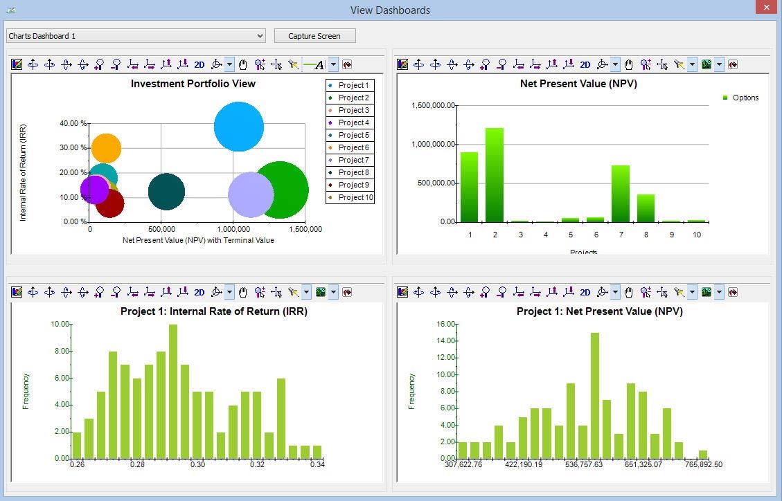
Figure 32 illustrates the Excel report generated in PEAT. After running all the models (simulations, tornado, scenario, etc.), users can click on Report | Report Configuration and then select or deselect the relevant analyses to run. When Run Report is clicked, the selected models will run and their results (data grids, models, charts, and results) are pasted into Microsoft Excel and Microsoft PowerPoint.

Recent Comments