Understanding and Interpreting S-Curves and CDF Curves
- By Admin
- July 7, 2014
- Comments Off on Understanding and Interpreting S-Curves and CDF Curves
The Four Moments, PDF, and CDF
The S-Curve, or Cumulative Distribution Function (CDF), is a very powerful and often-used visual representation of a distribution of data points. This section briefly reviews the salient points of the SCurve through the use of visual examples, starting with the four moments showing the Probability Density Function (PDF) or probability histogram shapes, and then moving on to the corresponding CDF charts. The following PDF and CDF charts were generated in the Risk Simulator │ Analytical Tools │ Distributional Charts and Tables tool.
The First Moment: Central Tendency (Mean, Median)
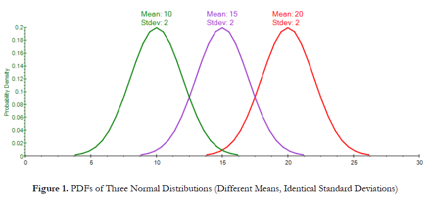
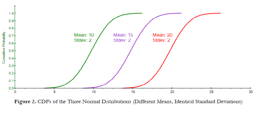
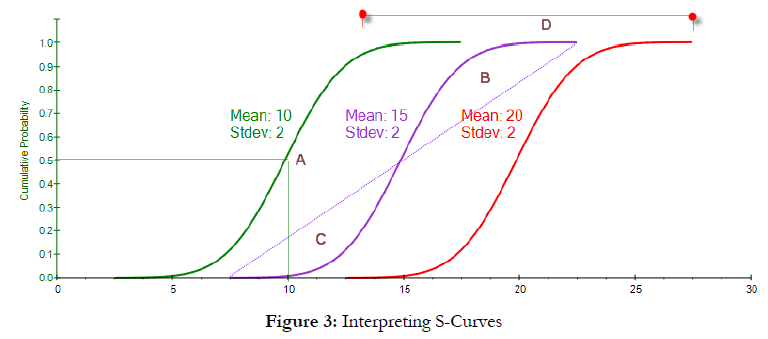
Figure 1 shows three Normal distributions with different first moments (mean) but identical second moments (standard deviation). The resulting PDF charts would simply be a shift in the central tendency, or location, of the PDF. Figure 2 shows the corresponding CDFs. We see three identical SCurves, indicating the same distribution, but they are shifted from one another, indicating the mean or central tendencies differ. Figure 3 shows the basic characteristics of the CDF, where the vertical axis is the cumulative probability, going from 0% to 100%, and the x-axis shows the numerical values in the distribution. The center of the S-Curve is the median or 50th percentile (A), and we can clearly see that the central tendency of the three curves are shifted away from one another, indicating a different median and mean (and because the Normal distribution is symmetrical, the mean is exactly at the median). The equal areas above (B) and below (C) the 45-degree line indicate a symmetrical distribution, where we have equally likely outcomes above and below the median. Finally, the length from one end to another (D) measures the spread, or risk, and we see that these three curves have similar widths or lengths, indicating similar risk levels (identical standard deviations).
The Second Moment: Risk Spread (Standard Deviation, Volatility, etc.)
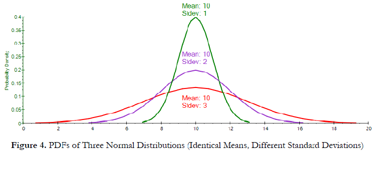
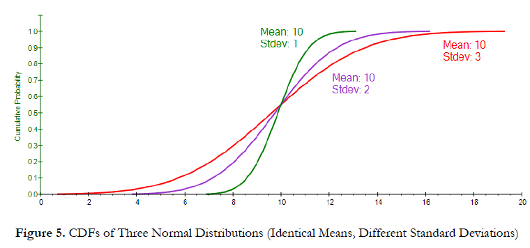
Figure 4 shows the PDF of three Normal distributions with identical means (first moment) but different risks or spread (second moments). A wider PDF has a higher risk spread. Figure 5 shows the corresponding S-Curves. We see that the steeper the slope of the S-Curve, the less risk, or width, of the distribution. The longer or wider the S-Curve, and the flatter the S-Curve, the higher the standard deviation (second moment, measuring risk, dispersion, and range of possible outcomes). Figure 4. PDFs of Three Normal Distributions (Identical Means, Different Standard Deviations) Figure 5.
The Third Moment: Skew (Directional Probabilistic Weights)
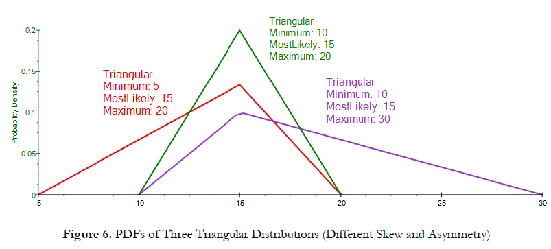
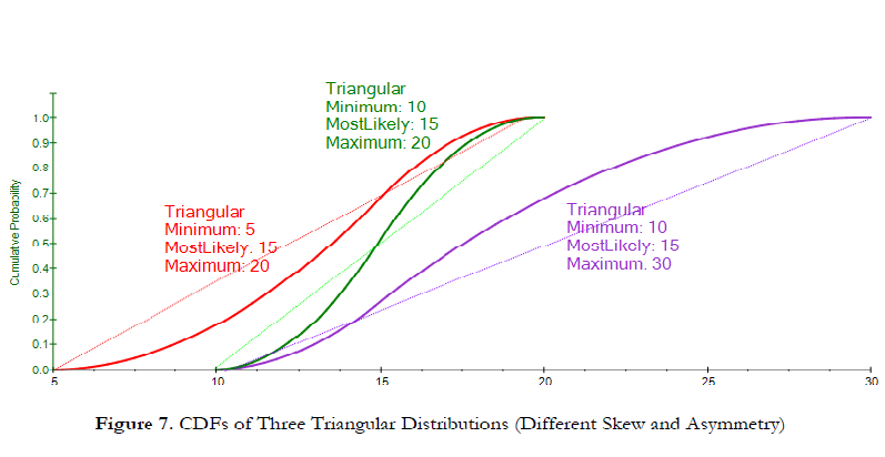
Figure 6 shows the PDFs of three Triangular distributions with identical Most Likely values (first moment) but different skews (third moments). The left, or negative, skew distribution (red) has a longer tail pointing to the left, or negative, side, whereas the positive, or right, skew distribution (purple) has a longer tail pointing to the right, or positive, side. A symmetrical distribution (green) has equal tails on both sides. Figure 7 shows the corresponding S-Curves. We see that when we draw a 45-degree line (starting from the minimum and ending at the maximum of the S-Curve), the area above/below the 45-degree line provides an insight into the skewness of the
distribution. We see that the negative skew distribution (red) has greater area below the 45-degree line than above, whereas the inverse is true for the positive skew (purple). The symmetrical distribution (green) has equal areas above and below the 45-degree line.
The Fourth Moment: Kurtosis (Extreme Tail Events)
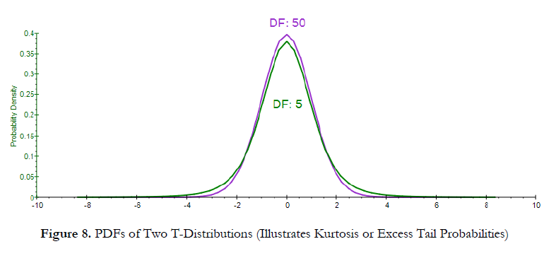
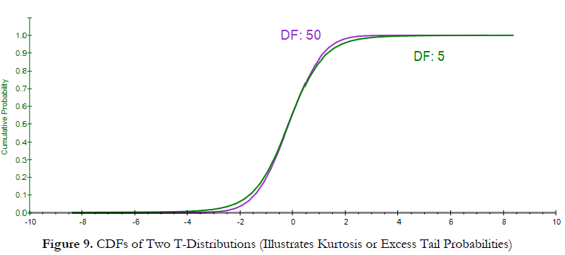
Figure 8 shows the PDF interpretation of the fourth moment of a distribution (or its kurtosis, measuring the extreme values in the tails). The T distribution with a higher degree of freedom (purple curve with the DF of 50) is closer to a Normal distribution, with zero excess kurtosis, whereas the fatter-tailed distribution (green curve with the DF of 5) has a higher kurtosis (higher probabilities of occurrence of extreme events in the tails). Figure 9 shows the corresponding CDF, and we see that the distribution with the fatter tails (higher kurtosis), indicating higher probabilities of extreme events, will have longer tails at the extreme low and extreme high (green curve) as compared to another distribution with less kurtosis (purple curve).
Multiple Moments: Shift, Spread, Skew, Kurtosis
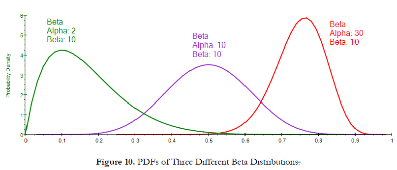
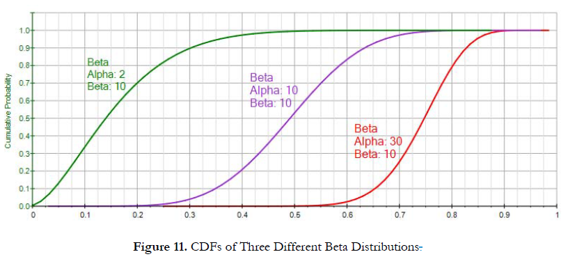
Figure 10 shows three Beta distributions. The green PDF shows a wide dispersion with a lower central tendency and a positive skew and a high kurtosis. Figure 11’s S-Curve for this distribution (green curve) can be used to arrive at the same conclusions: The 50th percentile is on the left of the other two curves (indicating a lower median or central tendency); the width from minimum to maximum is the widest (indicating a higher standard deviation or risk spread); the area above the 45-degree line is greater than the area below (indicating a positive skew); and the right tail is longer than the other two distributions, indicating a higher kurtosis. Using this approach, you can now very quickly compare and contrast different S-Curves and their related moments. As a hint, you can click on the Show Gridlines… button to add gridlines on the S-Curves or PDF curves, providing additional visual cues to the width and central tendencies of the curves.

Recent Comments